Translate

Wednesday, April 6, 2011

Piano Painting Tutorial


After
Several people have commented on my piano transformation and have asked for a tutorial explaining how I painted it and the colors I used.  So, here goes!  I will give a list of colors and where I used them at the end of this tutorial.

Am I the only one who gets nervous about those first paint strokes over wood?  It is so drastic!  Rest assured unpainted-wood-lovers, this piano was in desperate need of a face lift!
First of all, I began by removing the hardware that holds the front piece out at an angle, (the piece that holds the music book).  Be sure to put the screws in a bag, mark them and put them in a safe place so you can reattach them later.

I also removed the bottom panel underneath the keyboard. Every piano is different so just take a look at yours to see what can be removed to simplify the prep and painting process. You will end up with a much nicer job if you take the time to do this.

Next comes sanding and priming.  The finished product is directly related to the prep work so don't skimp!

I vacuumed as I sanded to keep dust to a minimum.
Primer

I didn't try to work the primer into every nook and cranny because I wanted some dark to show through to give it some depth and character.

You will need to prime/paint the keyboard cover and wait till dry before trying to paint the inside of the cover.  Be sure to paint those edges!

Painted around emblem
I didn't want to paint over the brand/logo so I painted around it.  I didn't care for the bright gold lettering so I toned it down a bit by highlighting parts of the letters with champagne metallic paint using an artists brush. I also covered it with glaze which I will mention in a minute.  As you can see, it is a bit messy and I got paint on the hinge.  These are things that I will have to go back and clean up.  I should have taped off the hinge!

And yes~ there is a missing piece of ivory on the front of a key.  I tell myself that it only adds character.  Do you buy that?


I painted the inserts with my wall color and painted the embellishments and trim pieces with a metallic Champagne color.


After everything was painted, it looked flat and boring so I mixed a tiny bit of burnt umber craft paint into some glaze and painted over everything.  This step unified the three colors and made it look more cohesive.

To give the piano a more age worn appearance, I lightly sanded only the areas that would naturally receive the most wear and tear, (corners, raised areas, knobs, etc).  However- if you like a more heavily distressed piece, go for it!  It is all about what YOU love and what works with your decor.

I am not finished yet.  Hold on... I coated the entire piano with 2 coats of Polycrylic to protect the finish.

         And now~ ~ ~

                 for~ ~ ~

                     the FUN part!


It was finally that time that we all look forward to.  Decorating the finished piece!  Isn't it always the vision that we have in our heads that drives us to the finish line? Decorating is the cherry on top.

You can see the before and after pictures of the mirror here and here.
.
Most of the items that I decorated with were pulled from my Etsy shop inventory.


Now for the paint colors:

Everything I used was water based and flat or semi-gloss.


Piano color: Oops!  I pulled the can out and it is only marked with a #973 instead of a color.  It is by Benjamin Moore, Regal Aquavelvet,  Base 2 319 2A.  This is paint that I had left over from a painting project about 12 years ago!  Not sure if they even make it anymore.

Any grayish taupe color would work or you could pull a light color in from your decor. I think that works better anyway because the look is more harmonious.      

Trim pieces:  I painted the trim pieces with the same color as the piano and then went over them with MM Modern Masters metallic water based paint using a light handed approach.  I don't like to kill subtle variations with a solid coat of paint. It gives more dimension this way.

Inserts: Again, I do not have a name for the paint color.  It is a very light aqua that I had custom mixed at Benjamin Moore and used on my dining room walls.  My sister and I experimented with mixing baby blue,  yellow/gold and white that I had on hand and took it to Benjamin Moore to have them custom match it.

Below is a picture of the label.  If you are interested in getting this paint color, you could jot the formula down and take it to them to have it mixed. They will keep the formula on file for you and you can call it anything you like.  I named mine "Cindy's Dining Room 2010".


After the paint dried, I mixed a tiny bit of acrylic burnt umber paint (craft) into some Tintable Glaze.  I used Valspar from Lowes but you can use any brand of glaze.  I coated the entire piano and waited a day before finishing it off with two coats of Polycrylic. (This doesn't seem to yellow as much as polyurethane.)  I probably should have done 3 coats but I think that I fizzled out.

Be brave!  Don't let that old hulk of a piano intimidate you. I would love to see pictures of your piano makeovers!


                       Painting this piano and (mismatched) bench was part of Our Dining Room Transformation.

                                                                   Thanks for looking!


If you arrived at my blog post via a Link Party please click on "Links To This Post" or scroll down and click on the button that will take you back to that site.  It is a courtesy to the kind blog host offering us all an opportunity to share our projects and finds.


Thursday, March 3, 2011

Etsy Pricing ~ Dr. Seuss Style

HAPPY DR. SEUSS WEEK!
                                                     
This got me thinking of an article on the Etsy Blog last year written in Dr. Seuss style poetry.  It was authored by an Etsy seller of "Handmade"  and was so cleverly done!

If you sell on Etsy and missed this blog post, you will definitely want to go back and read it here.

It was primarily written with "Handmade" sellers in mind. I sell in the "Vintage" category and what he was saying also applied to me and all other sellers in the vintage category so I had fun writing a comment in response:


I like what you said; I like it- I do,
It even applies to other sellers too.

Sellers of "Vintage" items will say
"To sell too cheap just doesn't pay".

First we drive to our favorite flea market,
Thrift store, estate sale- and then we park it.

Our cars run on gas, which we know isn't cheap,
I would ride my bike, but these hills are steep!

I cull, I scout, I poke and ponder
"Will this item sell on Etsy"… I wonder?

Once treasures are home, the work will begin,
Cleaning and shining, fixing that hem.

Now to photograph and write a description,
Think of the "tags" and figure the shippin’.

When a sale is made, the fun will start,
To find the right box, in itself, is an art!

Bubble wrap, peanuts- don't forget those,
Envelopes, mailers, up to the nose.

So if anyone thinks a price is too steep,
Keep in mind the process before you leap!


My name is Cindy Nixon 
So it's useful for me too
Without an X to spell my name
I don’t know what I’d do...do you?


Have some fun today and read Dr. Seuss with your child!


Monday, February 14, 2011

Mystery Heart Reflection

On Valentines Day in 2009 I noticed this heart on our wall.  I turned around to see where it was coming from....


   It was the first time in 25 years of living in our home that I noticed this!  (The heart, not the window!)


Cupid in the cross hairs!
               
HAPPY VALENTINES DAY!


Thursday, February 10, 2011

Dreamy Old White Stone Mill

Our kitchen window in Vermont
 Sometime soon I will be posting before and after pictures of this old house that we renovated while we lived in Vermont.  For now, I will just share a few photos of some of my favorite places.  I miss the quaint and beautiful architecture.
Old white mill in Dorset Hollow, Vermont
 We used to walk up through "the Hollow" just to gaze at this beautifully kept stone mill.  The peacefulness of this setting just drew us into into the moment, causing us to forget any cares.

Babbling brook
Art gallery in Chester


Equinox Hotel in Manchester, Vermont

Another angle

and another

This is our little house that we renovated.  Come on back in a bit for the full story, (no particular time frame connected to "in a bit"). I'll do my best!

Tuesday, February 1, 2011

Our Dining Room Transformation ~~~~the details~~~

THE CANDLE BASE IS AN OUTDOOR CAST IRON CEILING PORCH FIXTURE.  I TIED A VINTAGE REMNANT OF DELICATE FABRIC AND ANTIQUE CROCHETED WINDOW SHADE PULLS AROUND IT AND  EMBELLISHED IT WITH  A VINTAGE RHINESTONE STAR BURST PIN.  THE MERCURY GLASS CANDLE HOLDER IS ONE OF THE FEW NEW THINGS I PURCHASED.


Monday, January 31, 2011

Our Dining Room Transformation!

AFTER
AFTER
~ ~ ~ ~ AFTER ~ ~ ~ ~
As promised last week,  here are some pictures of my dining room makeover.  It is truly a transformation from a hodgepodge of color and styles to a soothing and calming color palette.

Here are a few before pictures: 

BEFORE
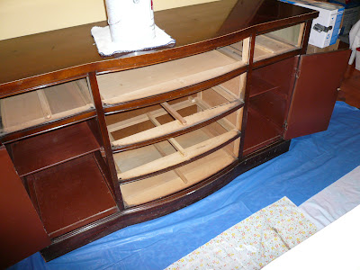
Dark, scratched, chipped and miserable furniture with nice lines.  "Old English" just wasn't doing it anymore and a total refinishing of a dining room table, buffet, china closet and 6 chairs was definitely out of the question!  

BEFORE
I have had this furniture for 35 years.  It was in the first house we purchased and the owners told us we could have it (minus the chairs) for $100.00.  There were no chairs with the set so we used folding chairs until we could find some that would be compatible.  Not thinking that we would ever find 6 chairs in the same style, I set out on a search.  It was years later that I saw an add in the newspaper for a solid mahogany dining room set.  I wondered what the odds would be that the owner would be willing to break the set up and only sell the chairs.  Hmm...it never hurts to ask!  

BEFORE

 BEFORE....(and some after in the background)

 When we went to see the set, it was the exact style as ours!  The lady was desperate to sell and immediately said that we could have all 6 chairs for $60.00!  

 
FIRST CHAIR WITH PRIMER

THIS POOR OLD PIANO WAS LOOKING PRETTY SHABBY...AND NOT IN A GOOD WAY!!! IT IS ENTERING IT'S FIRST PHASE OF A FACE LIFT...PRIMER.


BEFORE

HERE YOU CAN SEE HOW THE DINING ROOM WALL AND TRIM COLOR CLASH WITH THE KITCHEN! IT WAS TIME TO BRING IT ALL TOGETHER IN SIMILAR TONES.

oh yes....

And one more BEFORE picture ~ ~ ~ ~


 BEFORE

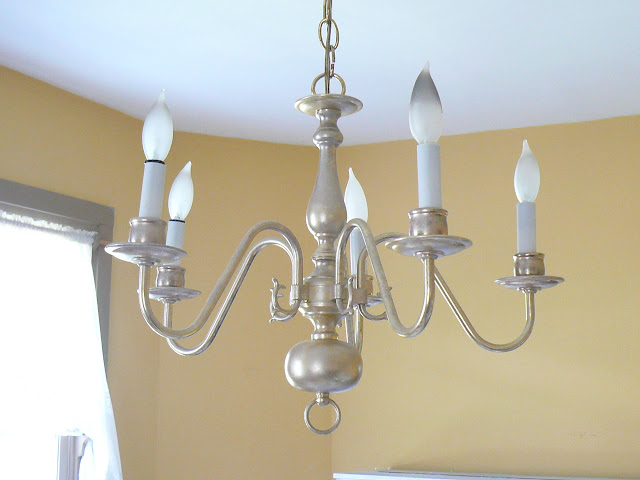
Bye bye old chandelier!  I hope someone was excited to find this at Goodwill!  It hung in our home for many years and I was MORE than happy to pass it along.


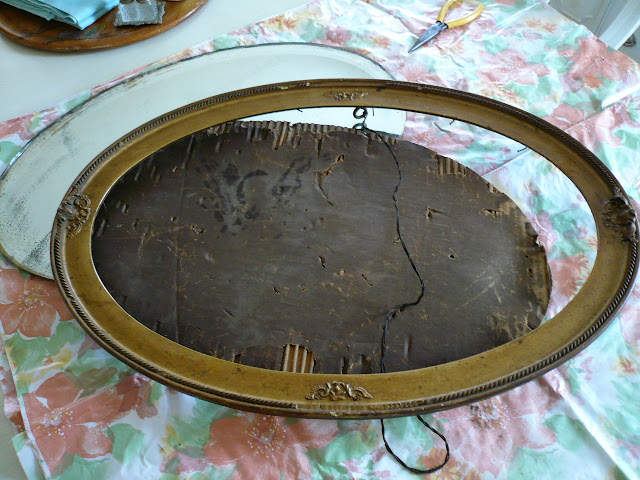
Oh!  I forgot about the mirror...an old mirror that I had in the attic for years.  I always loved the etched glass but couldn't quite embrace the frame.  I decided that I didn't want to get rid of it and would never use it if I didn't do something with it to suit my taste.

BEFORE

.....................................and two more mirrors that were hanging around in the workshop...................................

 BEFORE


BEFORE


~ * ~ * ~ * Okay ~ * ~ * ~ *

ARE YOU READY ?  ? ?

Now for the reveal


REMEMBER THE CHANDELIER FROM GOODWILL FOR $6.97?

THE FRAME ABOVE THE BUFFET IS ACTUALLY THE FRAME FOR A SMALL DOOR.  THIS WAS IN OUR BARN WHEN WE MOVED HERE.  I REMOVED THE DOOR (to be used in a future project) AND PLACED AN OLD EMBELLISHMENT ON TOP.  I PLACED AN OLD MIRROR INSIDE THAT I FOUND AT A FLEA MARKET.


  I MADE NATURAL LINEN CHAIR COVERS WITH ANTIQUE TWILL BALLERINA SLIPPER TIES. 
 I MADE THE DRAPES FROM PAINT DROP CLOTHS AND TRIMMED THEM WITH VINTAGE ICE BLUE SATIN RIBBON.I LOVE WHEN THE SUN SHINES ON THEM AND MAKES THEM SHIMMER ALONG THE EDGES!


                                                                          A TAFFETA SHOWER CURTAIN THAT I PURCHASED AT A FLEA MARKET AND SOME OLD CHEMICAL BOTTLES WITH CRYSTAL TOPPERS CULLED FROM MY "STASH".  SO MANY THINGS THAT ARE MEANT FOR MY ETSY SHOP NEVER QUITE GET LISTED!  I CAN'T RESIST!!!
DINNERWARE AND IRONSTONE PITCHERS, (once again pulled from my Etsy Store), AND STERLING FLATWARE THAT I INHERITED FROM MY AUNT.

I LOVE THIS DINNERWARE AFTER USING OUR BRIGHTLY COLORED HARLEQUIN DISHES FOR SO LONG!  I PACKED THEM AWAY FOR NOW.  (You never know when the color mood might return!  I don't want to burn any bridges here.  My taste is far too fickle.)    
OLD SHUTTER FROM THE BARN FOR RADIATOR SHELF.  I AM GOING TO BUILD A SURROUND FOR IT, (eventually)...but for now---it's good 'nuf fer me.

A VINTAGE CEMETERY BASKET ON TOP OF AN OLD CAST IRON WATER TANK HOLDER, (glass insert), ALL YARD SALE AND FLEA MARKET FINDS!
RANDOM OLD BOTTLES culled FROM YARD SALES.
I LOVE THIS DETAIL ON THE PIANO AND I WANTED TO HIGHLIGHT IT.  I PAINTED THE INSERTS WITH A MIXTURE OF THE WALL COLOR, MIXED WITH A TINY BIT OF GREEN.  THEN I UNIFIED THE BACKGROUND COLOR WITH THE ORNAMENTATION BY MIXING A BIT OF UMBER INTO A GLAZE AND APPLYING IT OVER THE ENTIRE PIECE. 

I HOPE YOU ENJOYED LOOKING AT MY REDECORATING PROJECT AND STOP BACK LATER FOR SOME MORE PHOTOS OF THE DETAILS.  THANKS SO MUCH FOR LOOKING!

HAPPY JUNKING, THRIFTING AND DECORATING!


SINCERE THANKS TO MY SISTER, VICKIE,  FOR GIVING UP ALMOST A WEEK OF HER LIFE TO HELP ME PAINT THE WALLS AND TRIM!  I DON'T KNOW HOW I COULD HAVE DONE IT BY MYSELF, OR GOTTEN THE WALL COLOR "JUST RIGHT".


Following is a list of paints that I used on the walls, trim and furniture as well as the technique I used on the furniture.  I did a separate tutorial for the piano which is listed below.  

  • Primed all furniture with Latex Kilz 
  • Base-coated all furniture with Brown Bread satin enamel by Behr  
  • Dry brushed Ultra Pure White Premium Plus interior semi gloss by Behr over the base-coat  
  • Coated all furniture with 2 coats of polycrylic.  (3 coats for buffet and table tops)
         
       Note*  I used leftover paint from previous projects to keep costs down and not waste what I had. 

I don't have a name for the wall paint color.  It is a very light aqua that I had custom mixed at Benjamin Moore and used on my dining room walls.  My sister and I experimented with mixing small amounts of baby blue,  yellow/gold and white that I had on hand and took it to Benjamin Moore to have them custom mix enough for the room.

Below is a picture of the label.  If you are interested in getting this paint color, you could jot the formula down and take it to them to have it mixed. They will keep the formula on file for you and you can call it anything you like.  I named mine "Cindy's Dining Room 2010".


All wood trim was painted with Calming Cream semi-gloss by Benjamin Moore


 I posted a Piano Painting Tutorial   for anyone that is interested.


If you arrived at my blog post via a Link Party please click on "Links To This Post" or scroll down and click on the button that will take you back to that site.  It is a courtesy to the kind blog host offering us all an opportunity to share our projects and finds.